
Google Maps has changed its visual design, but not everyone liked the update. It was criticized by Elizabeth Laraki, who once participated in the development of Google Maps UX design. She wrote about it on the X platform.
"Last week, the team dramatically changed the map’s visual design. I don’t love it. It feels colder, less accurate and less human. But more importantly, they missed a key opportunity to simplify and scale." wrote Elizabeth Laraki.
According to her, Google Maps has started to introduce updated colors. For example, all roads have turned gray, water has changed from blue to turquoise, and parks and open spaces are now mint green.
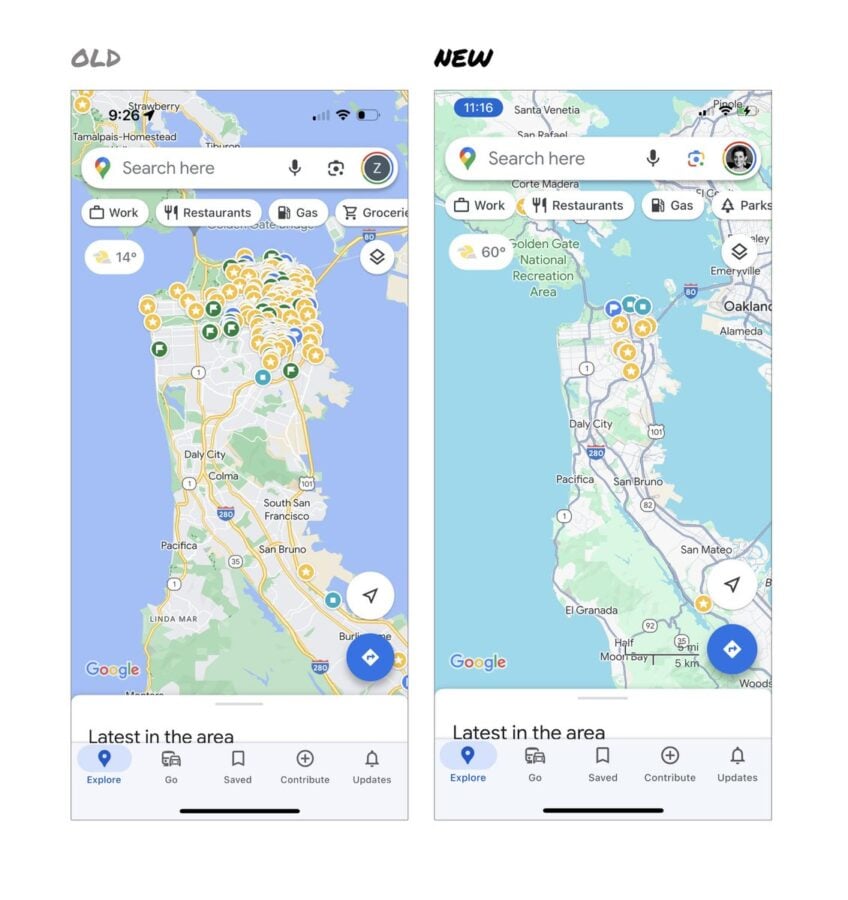
"It seems the goal was to improve usability and make the maps more readable. Admittedly, I do think major roads, traffic, and trails stand out more now. But the colors of water and parks/open spaces blend together. And to me, the palette feels colder and more computer generated," she explained.
Elizabeth Laraki also believes that the team missed an opportunity to clear the map of unnecessary elements that are superimposed on it. She counted 11 such elements marked on the image.
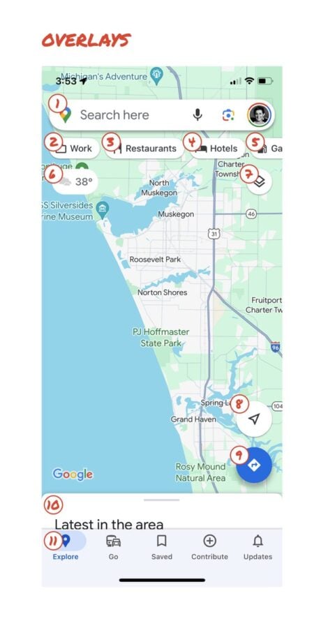
In her opinion, only things that will be very useful to people, such as the search field and the bottom bar, should remain on the map. The expert suggests moving the most used functions to the bottom bar, and hiding the less used ones somewhere else in the app. Everything else should be removed from the map.
Elizabeth Laraki also named the main points to consider: significant simplification, high priority for map visibility, and removal of outdated and underutilized features.


By the way, Google recently announced several interesting updates to Google Maps. These include improved public transportation routes, shared lists, and emoji reactions.