
Google Maps continues to receive minor updates. This time, the user interface of the application on smartphones has undergone a minor redesign. The design of icons for restaurants, shops, and other locations has been redesigned. This was reported by TechRadar.
Previously, foams had a tall, narrow stem that ended sharply at the point of attachment. The color of the foam was uniform along its entire length. Now the pins are much shorter and not as thin at the point of attachment. Each icon has a white background and its icon is placed inside a colored circle.
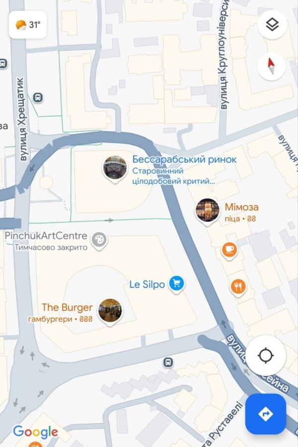
This change foams locations more uniformly with other elements on the map, such as stars, flags, and hearts. Although they are not exactly the same, all elements now have a similar rounded shape.
This makes the app much more uniform in terms of the appearance of its visual elements, although it can make it a little harder to distinguish icons from other elements on the screen.